Creating a theme
Inkdrop's interface is rendered using HTML, and it's styled via Less which is a superset of CSS. Don't worry if you haven't heard of Less before; it's just like CSS, but with a few handy extensions.
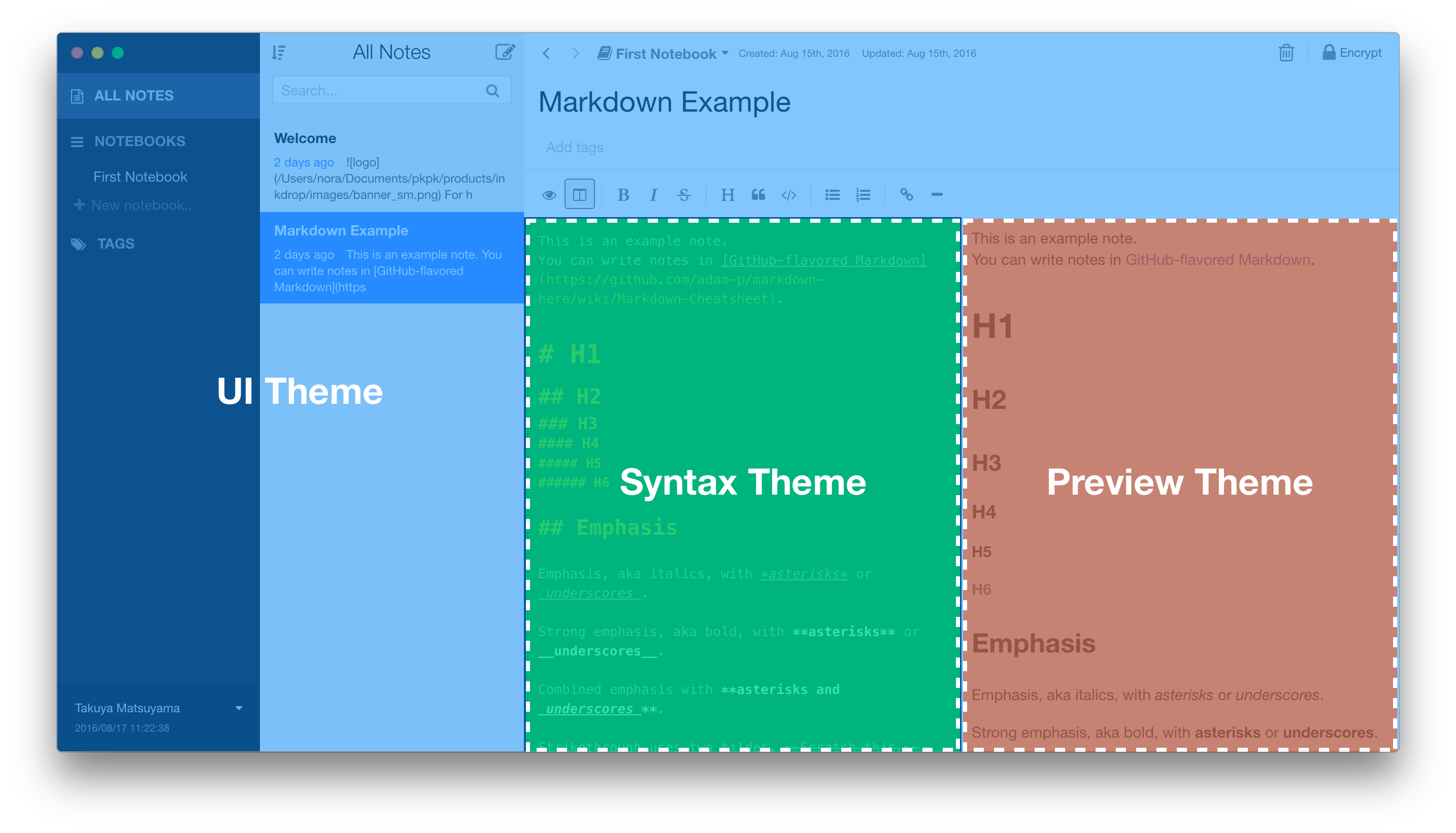
Inkdrop supports three types of themes: UI, Syntax and Preview. UI themes style elements such as the side view, the note list, drop-down lists, and the tool bar. Syntax themes style the note, gutter and other elements inside the editor view. Preview themes style the header, texts, code blocks and other elements inside the preview view.

Themes can be changed from Preferences which you can open by selecting the Inkdrop > Preferences on macOS or File > Settings on Windows and Linux, and clicking the Themes tab on the left hand navigation. Themes can be also installed with Inkdrop Plugin Manager.
Getting Started
Themes are pretty straightforward but it's still helpful to be familiar with a few things before starting:
- CSS Variables are entities defined by CSS authors which contain specific values to be reused throughout a document.
- Less is a superset of CSS, but it has some really handy features like variables. If you aren't familiar with its syntax, take a few minutes to familiarize yourself.
- You may also want to review the concept of a
package.json(as covered in Inkdroppackage.json). This file is used to help distribute your theme to Inkdrop users. - Your theme's
package.jsonmust contain athemekey with a value ofui,syntaxorpreviewfor Inkdrop to recognize and load it as a theme. - You can find existing themes to install or fork in the Inkdrop themes registry.
Creating a Syntax Theme
Tip: Syntax themes should end with -syntax.
Let's create your first theme which is called motif-syntax.
To create a syntax theme, do the following:
- fork the Inkdrop's sample repository on GitHub
- Clone the forked repository to the directory named
motif-syntaxin the local filesystem - Open a terminal in the forked theme's directory
- Let Inkdrop run in Development Mode by selecting the menu Inkdrop > Preferences on macOS or File > Settings on Windows and Linux, clicking the General tab on the left hand navigation, and check the "Development Mode", then reload the app by pressing
Alt+Cmd+Ctrl+L/Alt+Ctrl+L - Change the name of the theme in the theme's
package.jsonfile - Run
ipm link --devto symlink your repository to~/Library/Application Support/inkdrop/dev/packages - Reload Inkdrop using
Alt+Cmd+Ctrl+R/Alt+Ctrl+R - Enable the theme via the "Syntax Theme" drop-down in the "Themes" tab of the Preferences
Now you are ready to make changes!
Open up styles/colors.less to change the various color variables which have already been defined. For example, turn @base00 into #f4c2c1.
Then open styles/default.less and modify the various selectors that have already been defined. These selectors style different parts of code in the editor such as comments, strings and the line numbers in the gutter.
You may notice that the editor is built based on CodeMirror, you can also import various existing theme built for CodeMirror.
After making changes, reload the app to reflected changes.
Note: It's advised to not specify a font-family in your syntax theme because it will override the Font Family field in Inkdrop's settings. If you still like to recommend a font that goes well with your theme, we suggest you do so in your README.
Creating a UI Theme
Tip: UI themes should end with -ui or for dark theme-dark-ui.
To create a UI theme, do the following:
- fork the Inkdrop's default UI theme repository on GitHub
- Clone the forked repository to the local filesystem
- Open a terminal in the forked theme's directory
- Let Inkdrop run in Development Mode by selecting the menu Inkdrop > Preferences on macOS or File > Settings on Windows and Linux, clicking the General tab on the left hand navigation, and check the "Development Mode", then reload the app by pressing
Alt+Cmd+Ctrl+L/Alt+Ctrl+L - Change the name of the theme in the theme's
package.jsonfile - Run
npm installto install dependencies - Run
gulp buildto build theme files - Run
ipm link --devto symlink your repository to~/Library/Application Support/inkdrop/dev/packages - Reload Inkdrop using
Alt+Cmd+Ctrl+L/Alt+Ctrl+L - Enable the theme via the "UI Theme" drop-down in the "Themes" tab of the Preferences
Now you are ready to make changes!
You may notice that the styling UI is based on Semantic UI. It's mostly common in customizing the UI elements with it, so their documentation is very helpful to learn.
Theme Variables
Inkdrop's UI elements are styled with CSS variables. You may not be familiar with it because it's new technology. Don't worry, it's mostly same as variables in LESS. The CSS Variables let Inkdrop give meaningful names for styles of the UI components, for example, --note-list-bar-background variable styles the background of the note list bar.
Inkdrop's CSS Variables are defined in src/definitions/globals/variables.less, and you can change them by editing src/themes/default/globals/site.variables.
Creating a Preview Theme
Tip: Preview themes should end with -preview.
Let's create your first theme which is called motif-preview.
To create a preview theme, do the following:
- fork the Inkdrop's sample repository on GitHub
- Clone the forked repository to the directory named
motif-previewin the local filesystem - Open a terminal in the forked theme's directory
- Let Inkdrop run in Development Mode by selecting the menu Inkdrop > Preferences on macOS or File > Settings on Windows and Linux, clicking the General tab on the left hand navigation, and check the "Development Mode", then reload the app by pressing
Alt+Cmd+Ctrl+L/Alt+Ctrl+L - Change the name of the theme in the theme's
package.jsonfile - Run
ipm link --devto symlink your repository to~/Library/Application Support/inkdrop/dev/packages - Reload Inkdrop using
Alt+Cmd+Ctrl+L/Alt+Ctrl+L - Enable the theme via the "Preview Theme" drop-down in the "Themes" tab of the Preferences
Now you are ready to make changes!
Highlighting code blocks is built with CodeMirror, and CSS selectors for styling code blocks are compatible with it.
After making changes, reload the app to reflected changes.
Development workflow
There are a few tools to help make theme development faster and easier.
Developer Tools
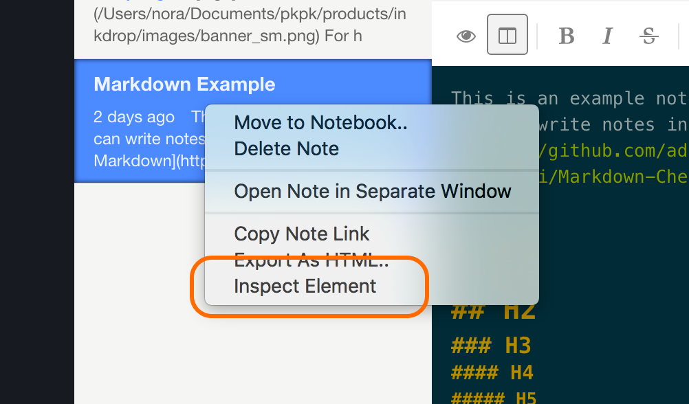
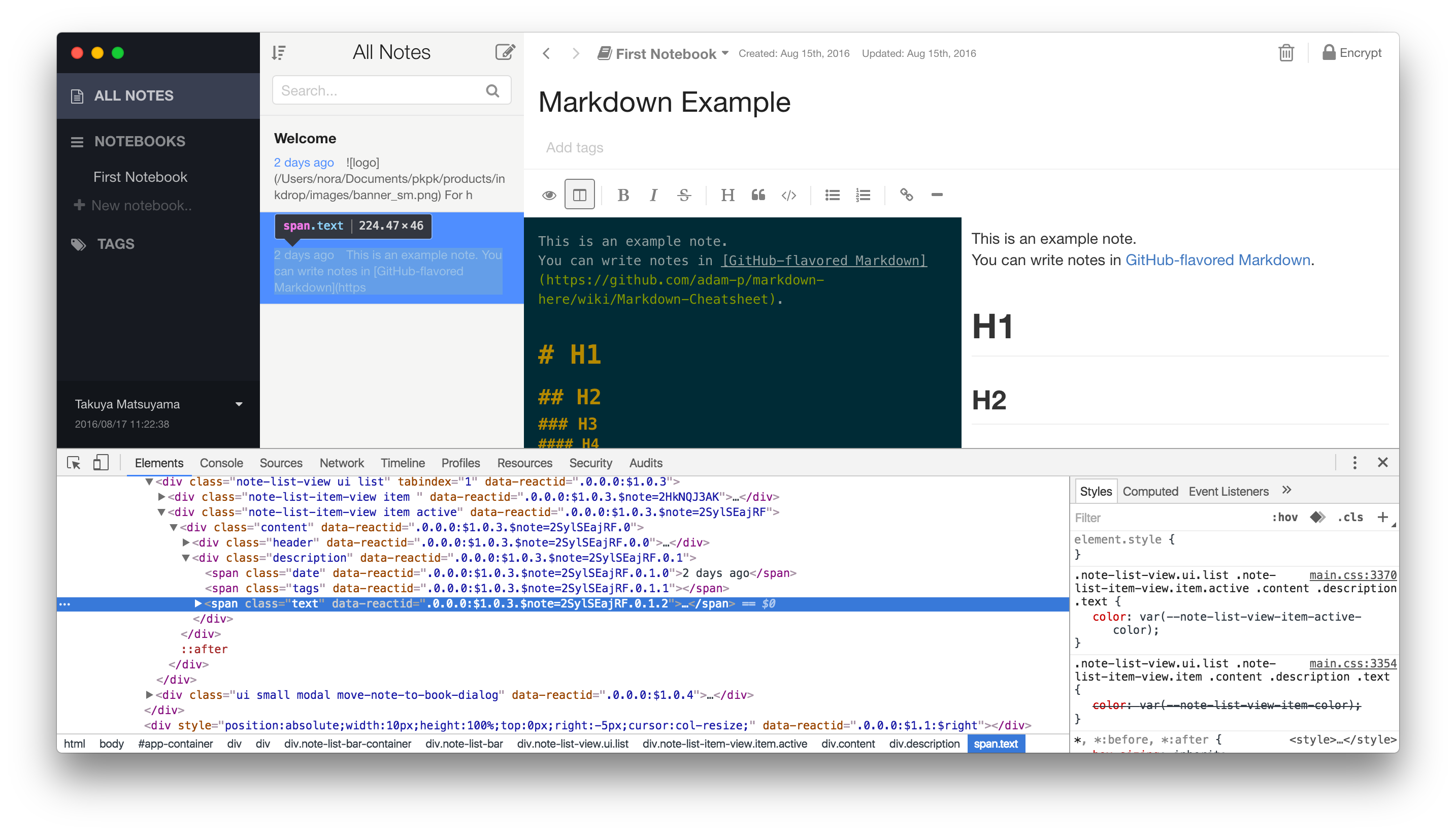
Inkdrop is based on the Chrome browser, and supports Chrome's Developer Tools. In Development Mode, Inspect Element menu is available in the context menu. You can right-click anywhere to inspect the HTML element.

You can check how it's styled with themes in the Developer Tools like this:

Check out Google's extensive tutorial for a short introduction.
Publish your theme
Once you're happy with your theme and would like to share it with other Inkdrop users, it's time to publish it. 🎉
Follow the steps in the Publishing section of the Word Count example. Publishing a theme works exactly the same.